
Geoshare Events
Building a design system before redesigning a feature built in code
Intro
Overview
Geoshare is an event-based platform with location sharing and chat, where all information received is encrypted end-to-end.
Challenge
Problem Space
I was given the task of redesigning the events/home page as it hadn’t been touched by a designer yet but had been fully developed out in the app.
- Nothing was documented
- No existing designs, or design system
- What was in dev was a result of a series of conversations of ‘can we add this’ and put straight into code, resulting in a bunch of bolted-on features
- Accessibility was not considered
As Carl Sagan says ‘to make an apple pie, first you must create the universe’, and so I couldn’t do anything without creating the design universe the app existed in first.
My Role & Contributions
- Design System Creation
- Created a DS for Geoshare from scratch using Material UI as a base
- Desktop Research
- Personas and Competitor Analysis using input from internal SMEs
- Multi Platform & Device
- OS specific designs were required at times during flows. Had to identify these and cater for them in the DS.
- Prototyping
- Liaised with C-Suite to come to final designs
- Interaction Design
- Provided options for interaction design
Process
A multi-step process to contain the chaos
After doing a full audit of the app, taking stock of every user journey flow, every conditional state, every size, colour and font, I condensed them all into a design system of primitives, something AI could have done much quicker now. What I streamlined was the quick pace of decisions, once each primitive was accounted for, I decided how to condense over 100 font styles and weights and sizes into 17 text styles that covered the whole app and could be applied into any context. This had to be applied to the code base
Looking at different design systems told me how to structure the components. I landed on several values to socialise with the team as an anchor point moving forwards.
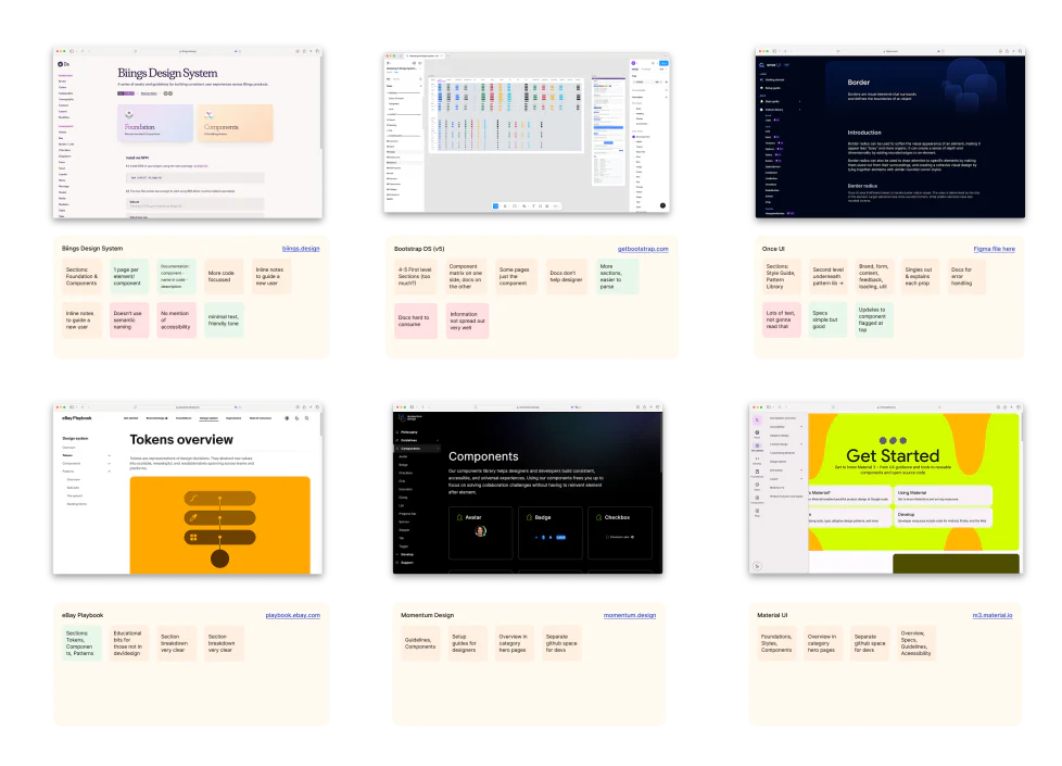
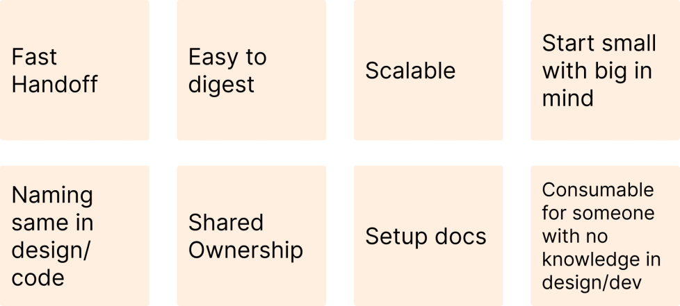
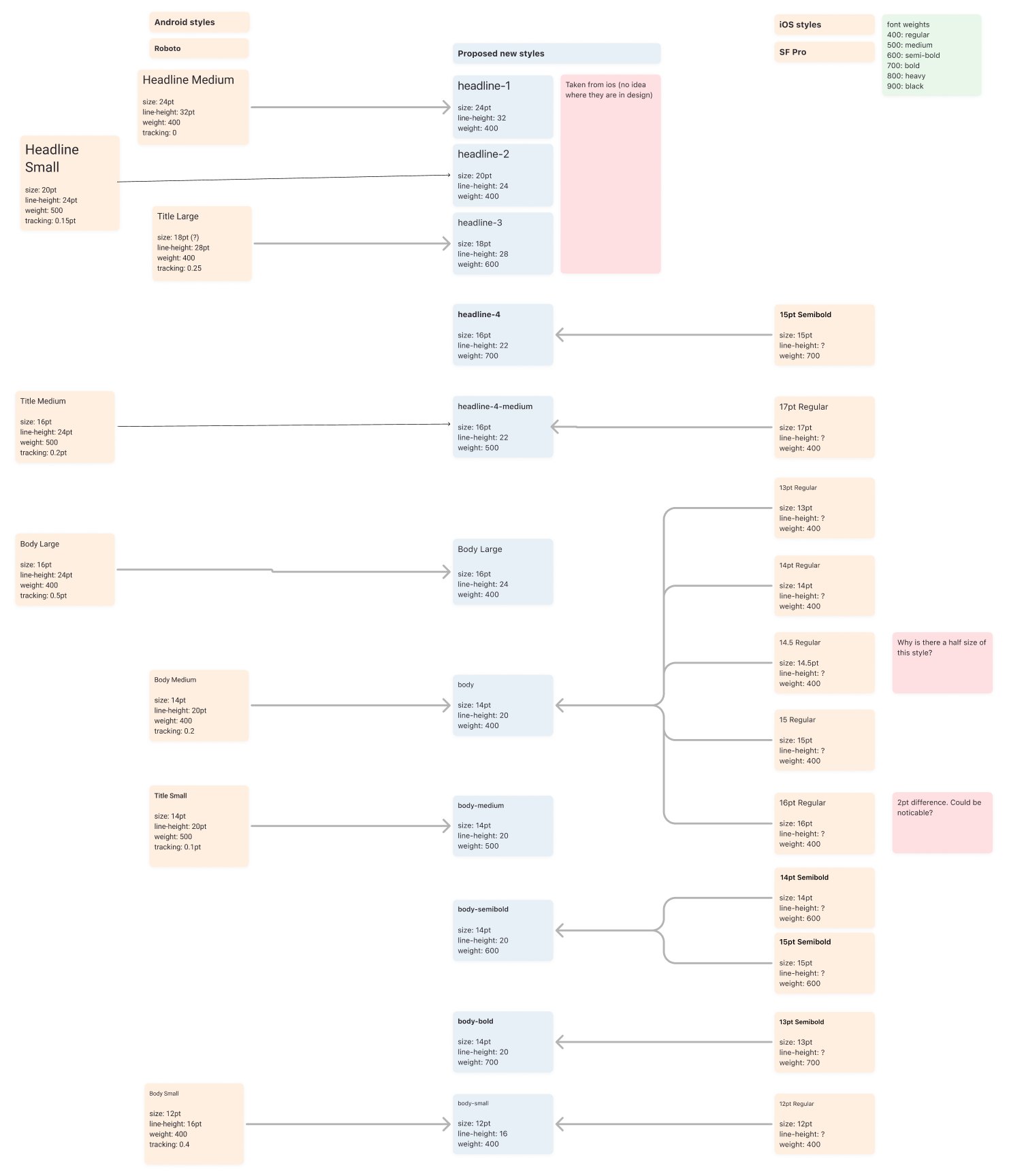
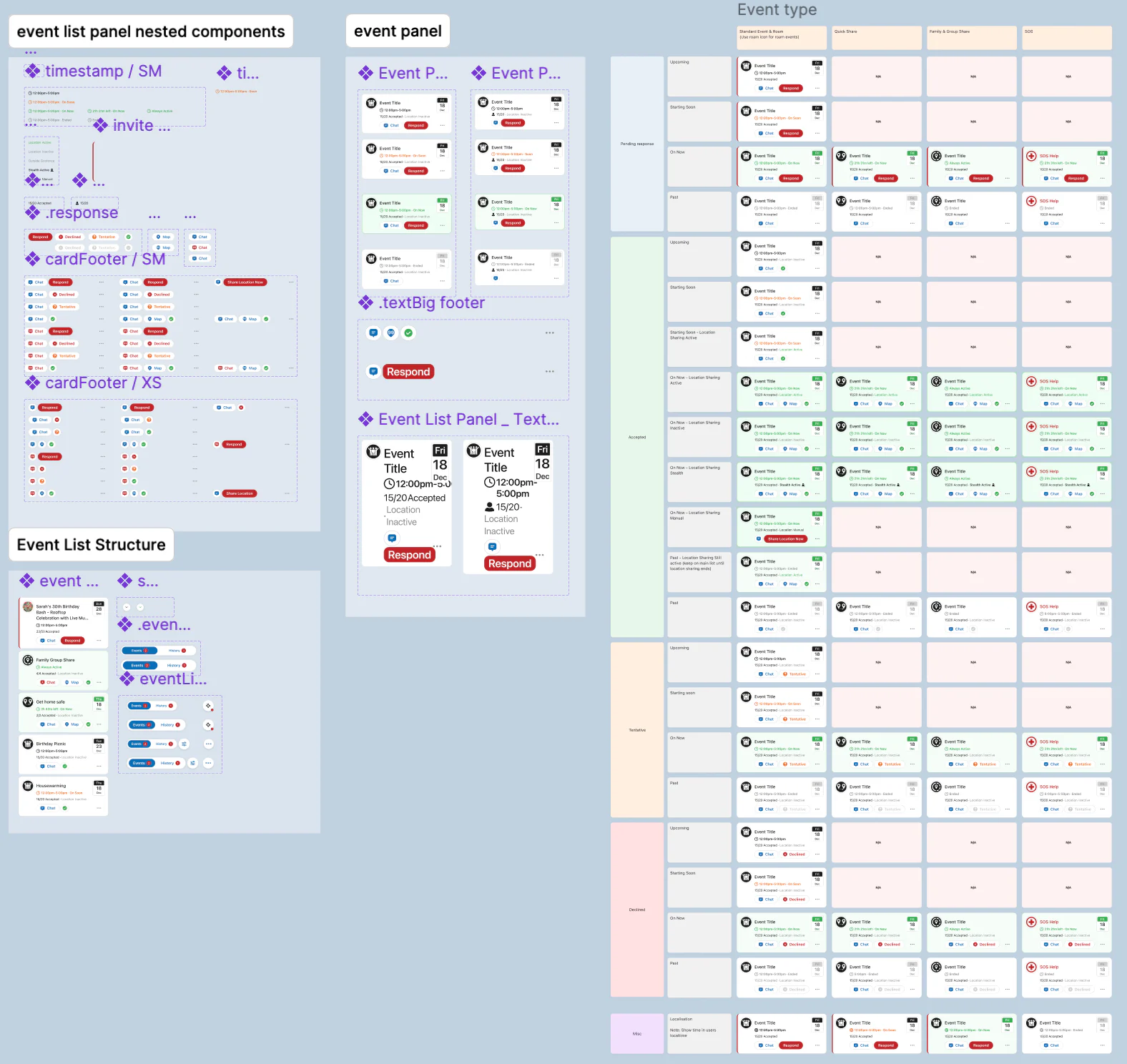
Building the design system came next. Rebuilding each component from a static design and ordering and documenting them whilst adhering the values.
Results
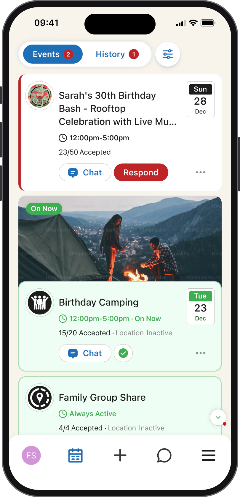
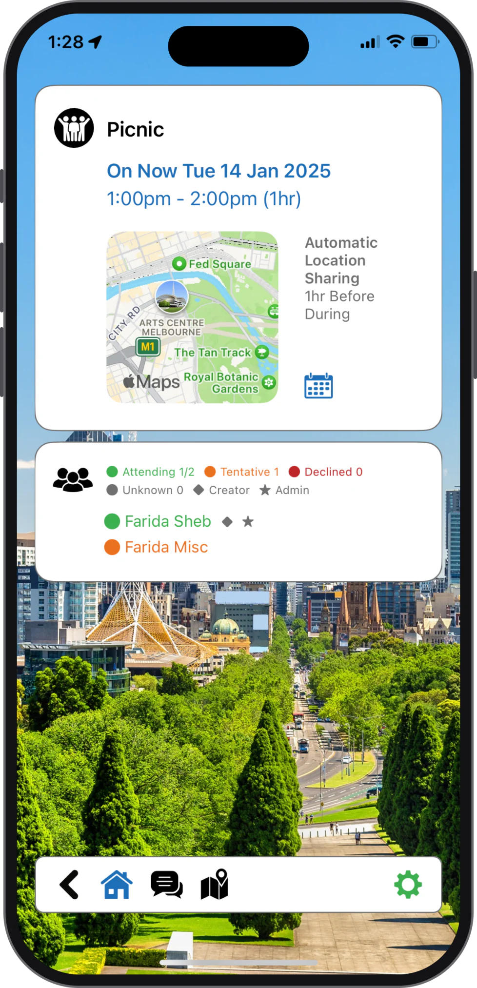
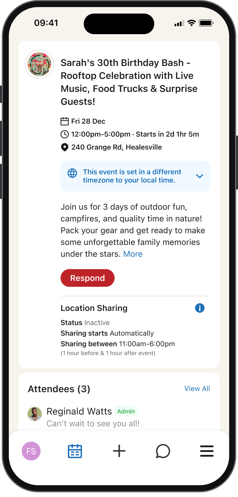
With a new design system this meant being able to design quickly at scale. Below is an example of the home screen redesign and event details page, the most important screens of the app. Unfortunately this never shipped and the company lost funding so no metrics, but a few before & afters:
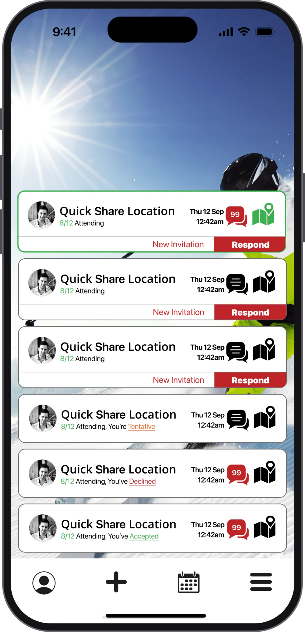
Conclusion
Lessons learnt
- Being the founding/sole designer is lonely: I found myself scheduling a bi-weekly meeting with the devs to bounce ideas off so I wasn’t stuck in my own echo chamber, and sending designs to friends also in the industry to make sure the design decisions that were my responsibility were sound (while balancing founder ideas at the same time).
- Who are you documenting this for? Some of the design system docs I left barebones to collaborate with devs on rules for components, as I found the DS felt more of a collaborative organism this way. The PDs for features were mainly to log conversations and decisions made, as they often got lost in the sauce.
- Frontloading your energy on the system means faster ideation later: Redesigning the event & event overview page was fearless as I knew that the components that I used already existed, and if they needed to be changed or updated, I could see where in the app they were being used and if this change could easily apply to the rest of the app.