
Zeller App
A native app for 40,000 business owners on the move
Intro
Overview
Zeller is a fintech startup that offers financial services & payment solutions for businesses.
Challenge
Although the website was completely responsive, users still urged for an app as business owners are often on the move and found that there was too much friction in opening a web browser and logging in to find what they need.
I took the existing backend for desktop and created a tailored design system, UX flows and information architecture for iOS and Android app experiences. My front-end skills supported efficient collaboration with a remote front-end team in two different timezones (Poland & India respectively), asynchronously and with dedicated ceremonies. Below I’ve mentioned some of my favourite parts of the design/build process.
My Role & Contributions
- Design System Creation
- Created a DS for Zeller App
- Data Visualisation
- Designed how sales are displayed as well as in built date & location filtering
- Interaction Design
- Created all sections for the app until it was feature like-for-like with web
- Prototyping
- Provided prototypes for micro interactions and faster feedback
- Dev Handoff
- Liaised with dev teams for pixel-perfect designs
Outcomes
- Shipped in 12 months (6mo rapid iteration, 6mo development)
- 40,000 monthly active users
- Average open rate: 30 times per month
- 4.8 stars on App Store (800 ratings)
Home
Home Screen
Widgets were chosen based on most used features on the web and were all SM to MD sized features on their own, from design to development:
Payments
- Weekly earnings graph: This was the main page of the website and was the most used, so adding this in the home was a no brainer. It is interactive and filtered by day/month, as well as shop location (site)
- Latest payments transactions: Customers found it helpful to view the latest transaction on the move, in case an employee has mentioned a bad actor. It also provided an easy way to access all their transactions transactions quickly.
- Latest settlements: With percentage indicator from the day before, based on shop location (site) and comparison to same day last week or month. This was helpful for business owners to view their profits at a glance and to see if any settlements failed, as UI did not yet exist for this purpose.
Banking
- Latest card transactions: providing a quick view of payments made by the cards issued to employees
- Debit card list: List of debit cards issued (or your own if not admin)
- Corporate card list: List of corporate cards issued (or your own if not admin)
Corporate Cards
Multi-device
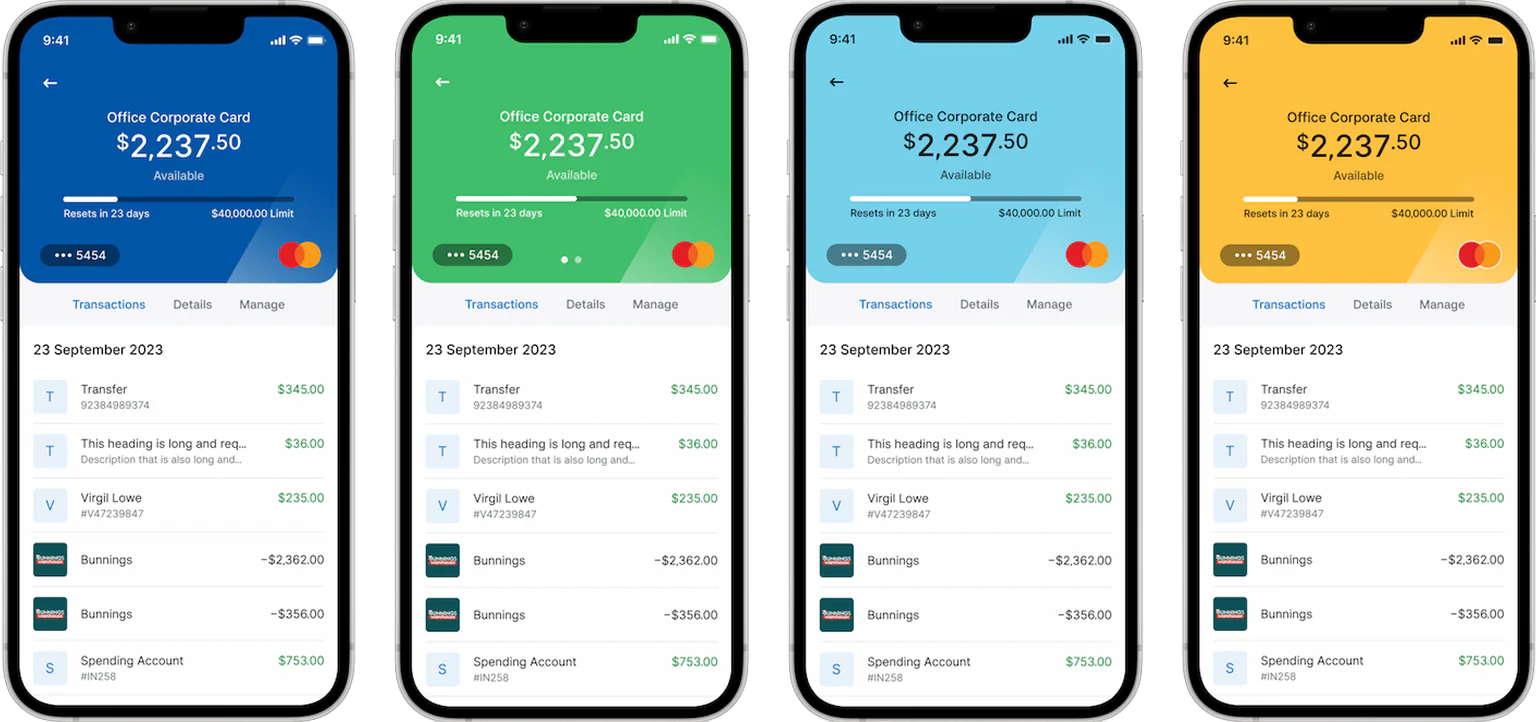
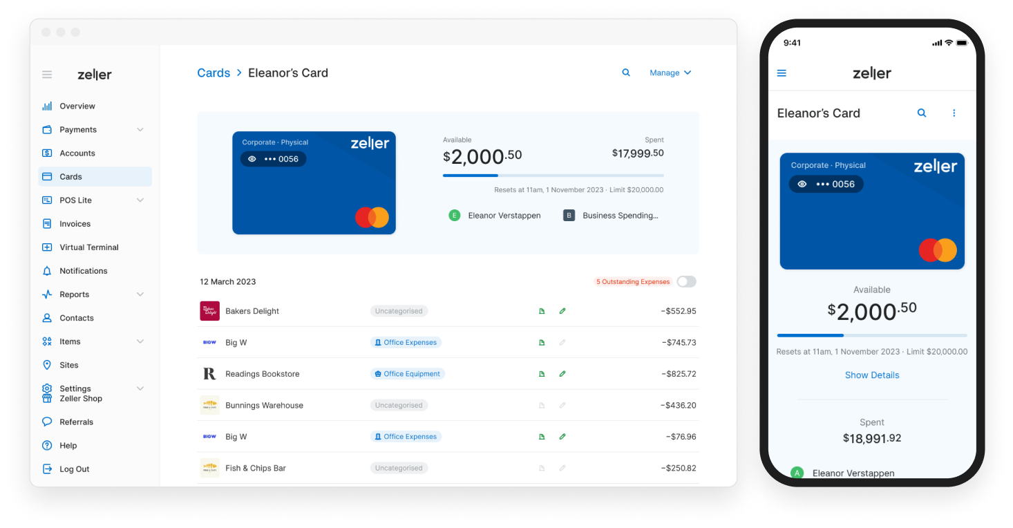
Corporate cards was to be designed across multiple platforms and had to be designed with such in mind. Given the app was a bit of a style departure from the web, intentionally streamlined to suit an app experience, the style followed suit. What resulted was a design that was different between web & app use however still tethered to itself staying true to the branding.
Navigation
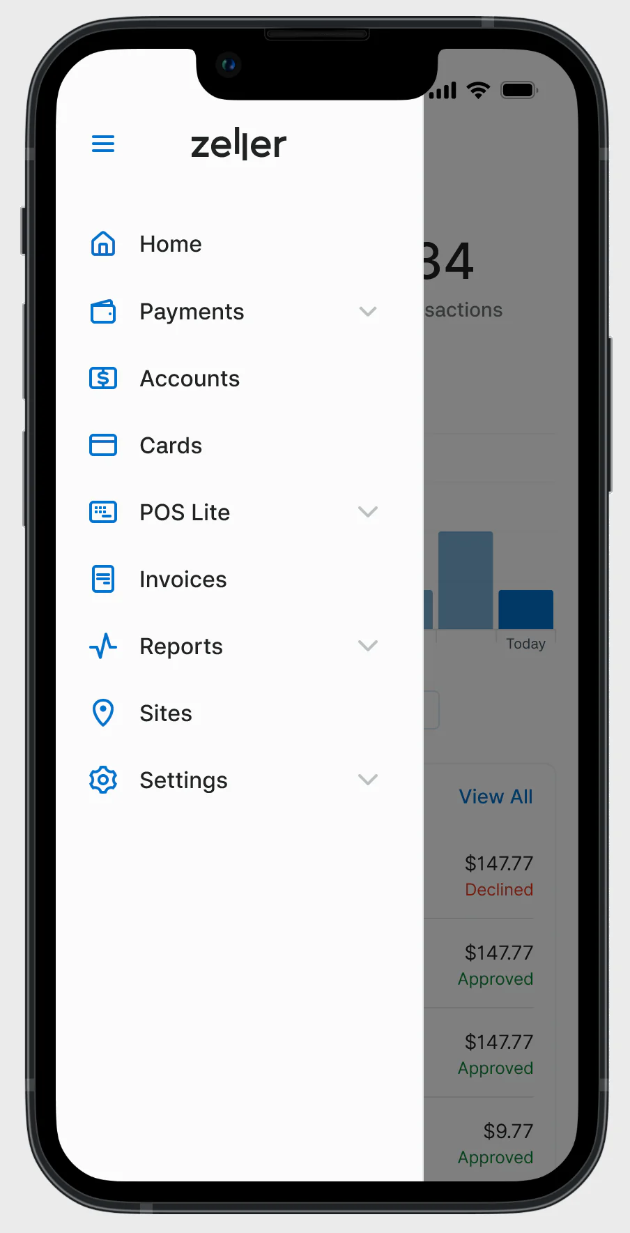
I was given the opportunity to completely rethink the nav with the idea that it wanted to be ‘original’, however I argued we should strive for simplicity when it comes to the main pattern of the app and stick with what the users already know; something between a tab bar & the current nav on web.
My experimentations landed on a nav grouped by type, however when tested this deemed confusing for users as the types were defined internally and only made sense within Zeller, so in the end we landed on a nav that mimic’d the web which we knew users were already familiar with. This was a hard call to make as I spent over a month losing my marbles on all the ways a nav could fashion itself; but it was not worth having the launch be a flop.
Conclusion
Lessons learnt
- Patterns are reliable for a reason: It’s much more useful to save experimentation for things that attribute to a brands personality, not something that should be pragmatic and logical for the user like the navigation. For a similar effect we focussed more on the micro interactions that are an add-on to easy to use UI, not a distraction from it.
- Less is more: With mobile screens being smaller I didn’t have the luxury of screen real estate when displaying information; this meant I really had to laser-focus in on what each pages top 3 functions were and how easy it was to complete those functions. The auxiliary information always found a place elsewhere, landing safely in a place ready for the user to easily find when they actually needed it.
- Make the accessibility call: The white text on green card would fail your worst WCAG test, and I ignored this for the sake of consistency. This sort of keeps me up at night, having matured as a designer since. Given this was a startup aiming for APRA credibility, I would have taken more time to resolve this issue more wholly had I been working on this now.